ACADACA · UX DESIGN INTERNSHIP
Clearer choices.
More confident shopping.
Two e-commerce projects exploring how focused UX changes can help shoppers understand a product and discover what comes next.
My role UX Design Intern
Methods Audits, interviews, prototyping and usability testing
Brands Floafers + Lilly Pulitzer
01 · FLOAFERS
Make the product’s value clear.
Problem
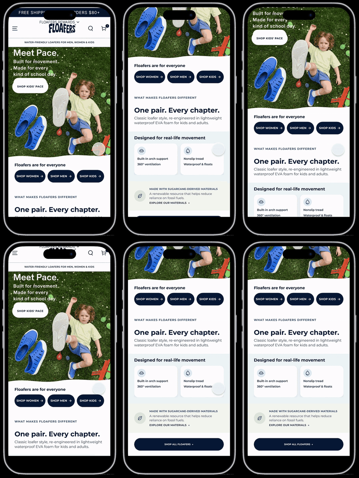
Shoppers struggled to understand who Floafers was for and what made the shoes distinctive.
Design decision
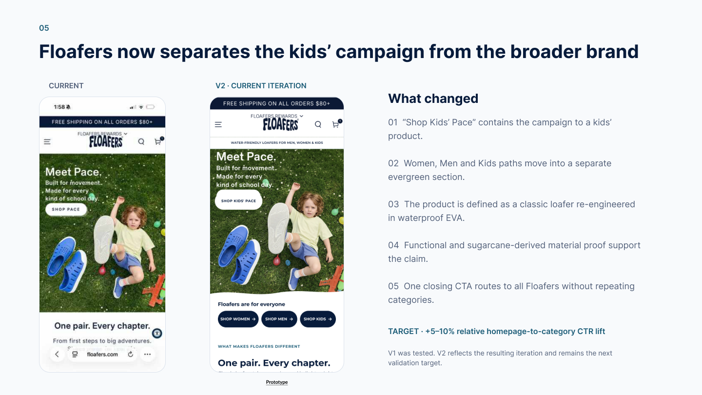
Clarify the hero message and provide direct Women, Men and Kids shopping paths.
Proposed V2
Separate the kids’ campaign from the broader brand story, simplify duplicate links and introduce more representative family imagery.
02 · LILLY PULITZER
Keep discovery going in the tote.
Problem
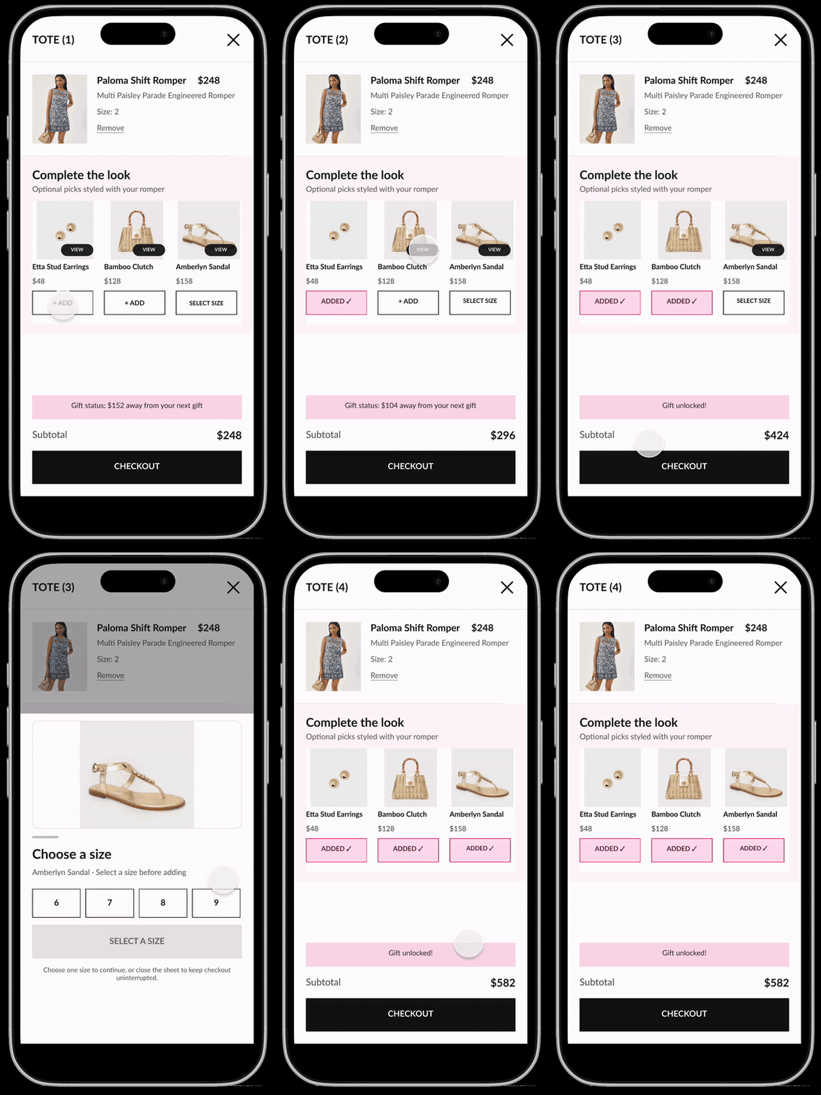
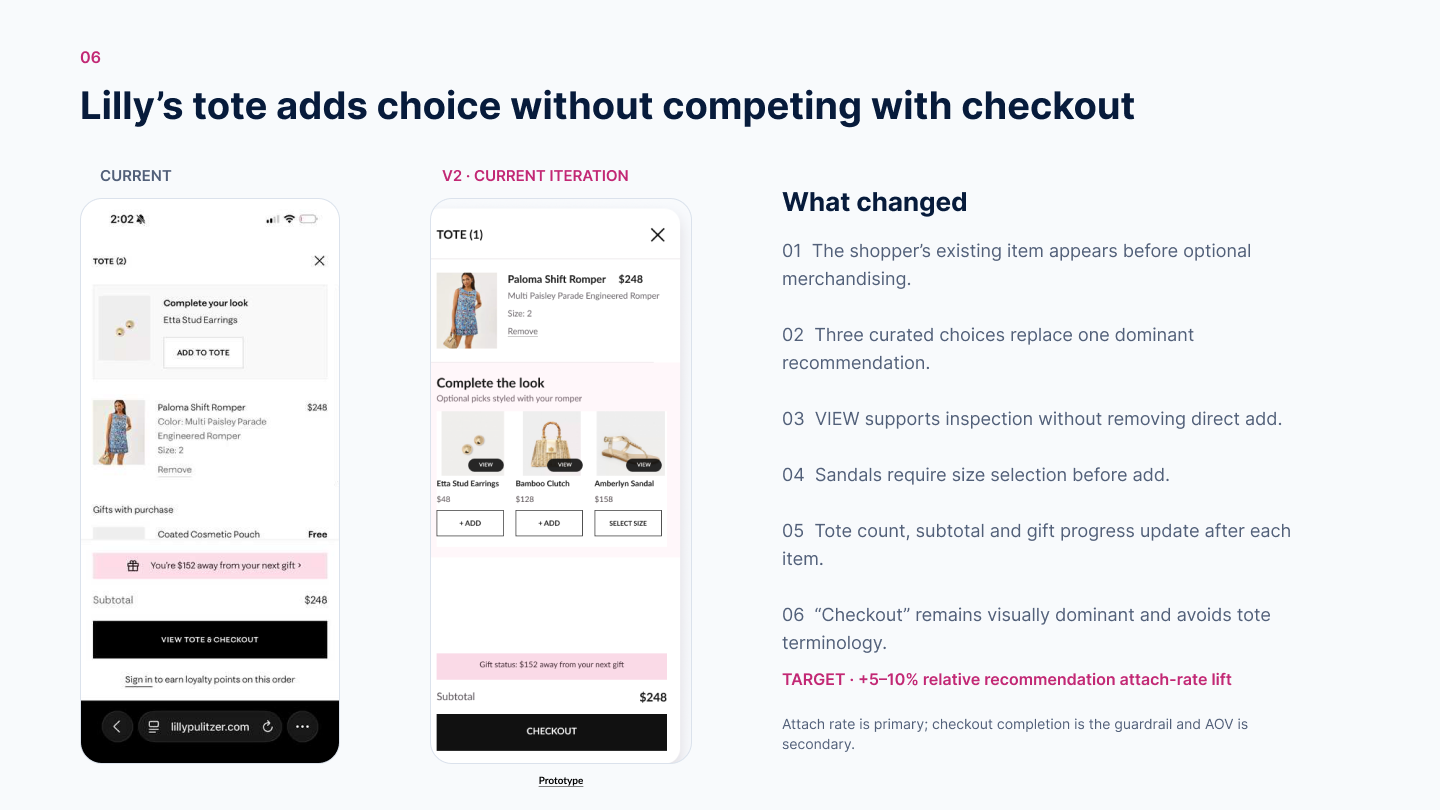
Outfit recommendations on product pages largely disappeared in the tote, which offered only one subtle suggestion.
Design decision
Bring curated complementary products into the tote with clear controls, size selection and dynamic totals.
Proposed V2
Add a closer product view and refine recommendations while keeping checkout prominent.
THE CHALLENGE
Find the friction worth fixing.
I audited both storefronts and spoke with six shoppers to identify where they hesitated. For each brand, I prioritized one opportunity that connected a user need with a business goal.
Scope: Focused interventions within the existing brand and platform—not a full redesign.
TESTING + ITERATION
Test assumptions. Refine the next version.
Six participants took part: three tested each brand’s V1 prototype and explored the other brand’s live site. I used their behavior and feedback to refine hierarchy, choices and interaction states.
Evidence boundary
V1 was tested. V2 incorporates those findings but has not been validated in a follow-up test. This was qualitative research, not a controlled conversion experiment.
Handoff
I presented the work to my product manager for potential development consideration. Implementation and business impact are not confirmed.
What six usability tests changed
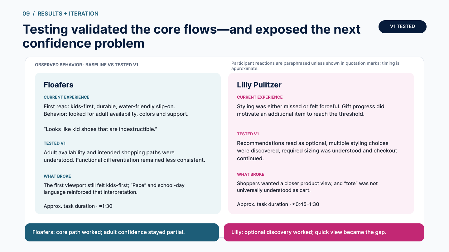
The core flows worked—but each test exposed a different confidence gap. I used those behaviors to define V2 instead of polishing from preference.
FLOAFERS · CORE PATH WORKED
Adult availability and shopping paths became clear. The first viewport still read as kids-first, so V2 separates the seasonal campaign from the broader brand story.
LILLY PULITZER · DISCOVERY WORKED
Multiple recommendations were found and checkout continued. Shoppers wanted a closer product view, so V2 adds quick view without weakening direct add.
Product judgment, not a visual exercise
I narrowed two broad storefront audits into buildable interventions, defined success metrics and guardrails, tested the riskiest assumptions, and documented the states a team would need beyond the happy path.
Additional internship work involved a confidential e-commerce client and is not shown publicly.
A focused starting point for development.
DESIGNED FOR THE NEXT DECISION
The handoff connected user friction, design decisions and test findings. Next steps would be to validate V2, assess feasibility with engineering and measure outcomes after launch.