Detroit Acupuncture · Client website + brand system
Designing trust before the first appointment.
For people unfamiliar with acupuncture, the barrier was not only finding a service. It was understanding what would happen, whether the care felt credible, and whether they would feel welcome. Our four-person DNEP team created a cohesive identity and website that made the practice clearer, warmer, and easier to navigate.
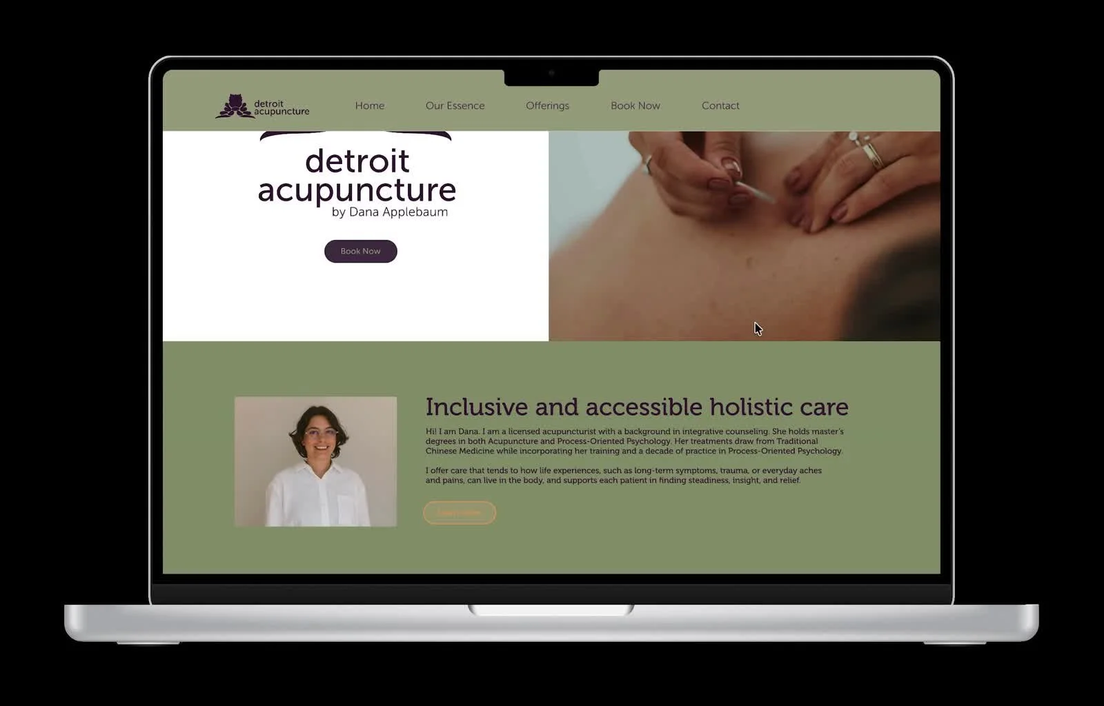
The real design problem was uncertainty.
The existing website held valuable information, but flat hierarchy, inconsistent calls to action, and a visual presence disconnected from social media made the practice harder to understand. We asked what people knew about Eastern medicine—and what prevented them from trying it.
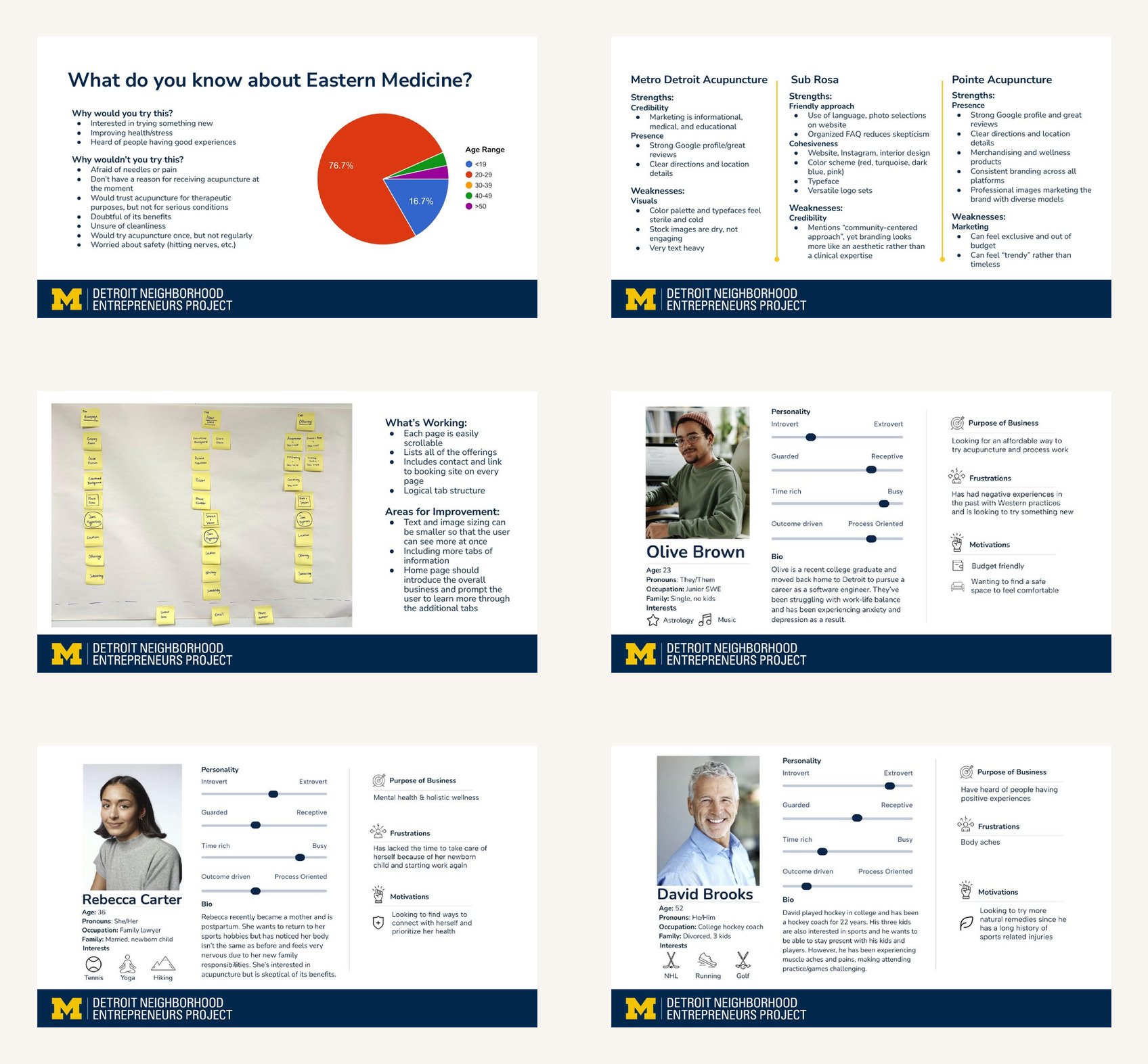
Give people the right information in the right order.
Introduce the whole-person approach and clarify who the practice serves.
Explain Eastern medicine in approachable language without overwhelming first-time visitors.
Make services, booking, contact information, and flexible pricing easy to find.
Center Dana, the studio, and inclusive care rather than generic wellness imagery.
A warmer identity grounded in place and practice.
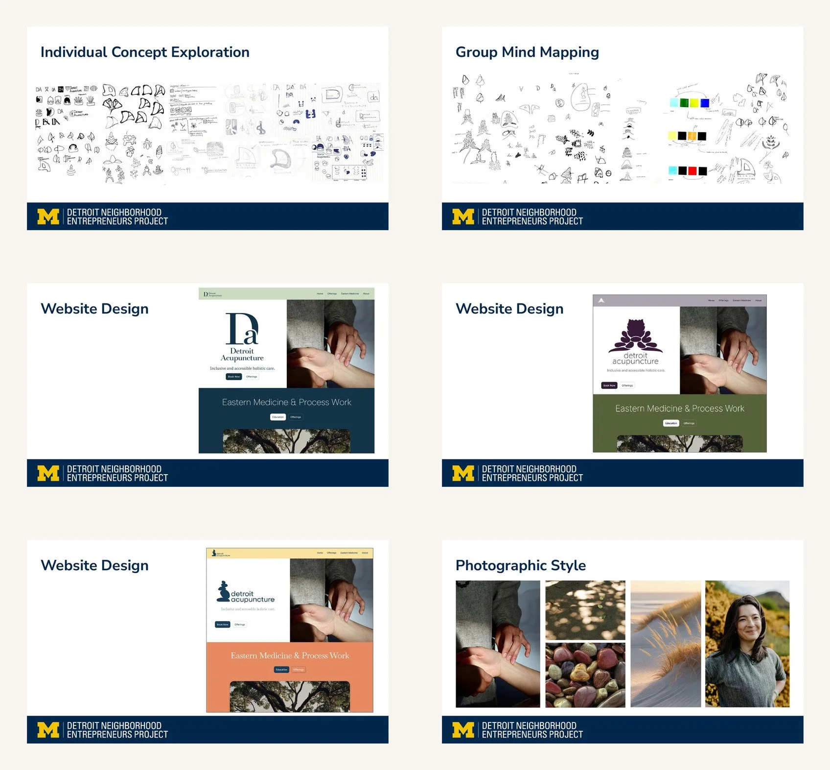
The selected identity uses the heal-all plant—a form found across Michigan and used in Eastern medicine—as a bridge between place, healing, and the practice’s philosophy. A grounded palette, clear sans-serif typography, and natural photography extend that idea into a flexible system.
I contributed to early logo exploration and refinement, developed the color direction, influenced typography, and contributed photography concepts. The selected logo was designed by another teammate.
The identity and architecture evolved together.
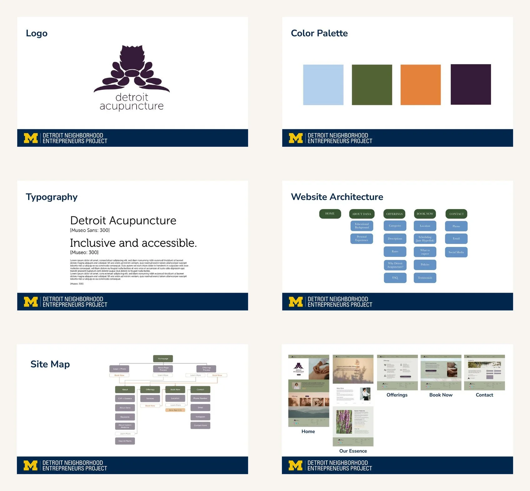
I led much of the information architecture and designed roughly half of the wireframes and high-fidelity prototype. We organized the experience into five clear destinations—Home, Our Essence, Offerings, Book Now, and Contact—with consistent navigation, buttons, and hierarchy.
A cohesive path from learning to booking.

The high-fidelity prototype carries the brand through the practice story, offerings, booking, and contact. Squarespace implementation was led primarily by a teammate, with the group translating the prototype, content hierarchy, and visual system into the live site.
06 · OUTCOME
A clearer, more recognizable digital presence.
The identity and website were implemented, and the owner felt the work gave the practice a stronger brand identity. We did not receive post-launch analytics, so the result is presented as implementation and client response—not a claim of measured business impact.
What I took forward: Accessibility is also emotional. People need to understand the care, recognize that the space is meant for them, and know exactly what happens next.
