The Reefline · Visual identity in practice
Making one idea legible across disciplines—and languages.
The Reefline brings public art and marine ecology together off Miami Beach. I helped turn that multidisciplinary mission into a consistent visual system for supporters, event visitors, scientists, artists, architects, and the public.
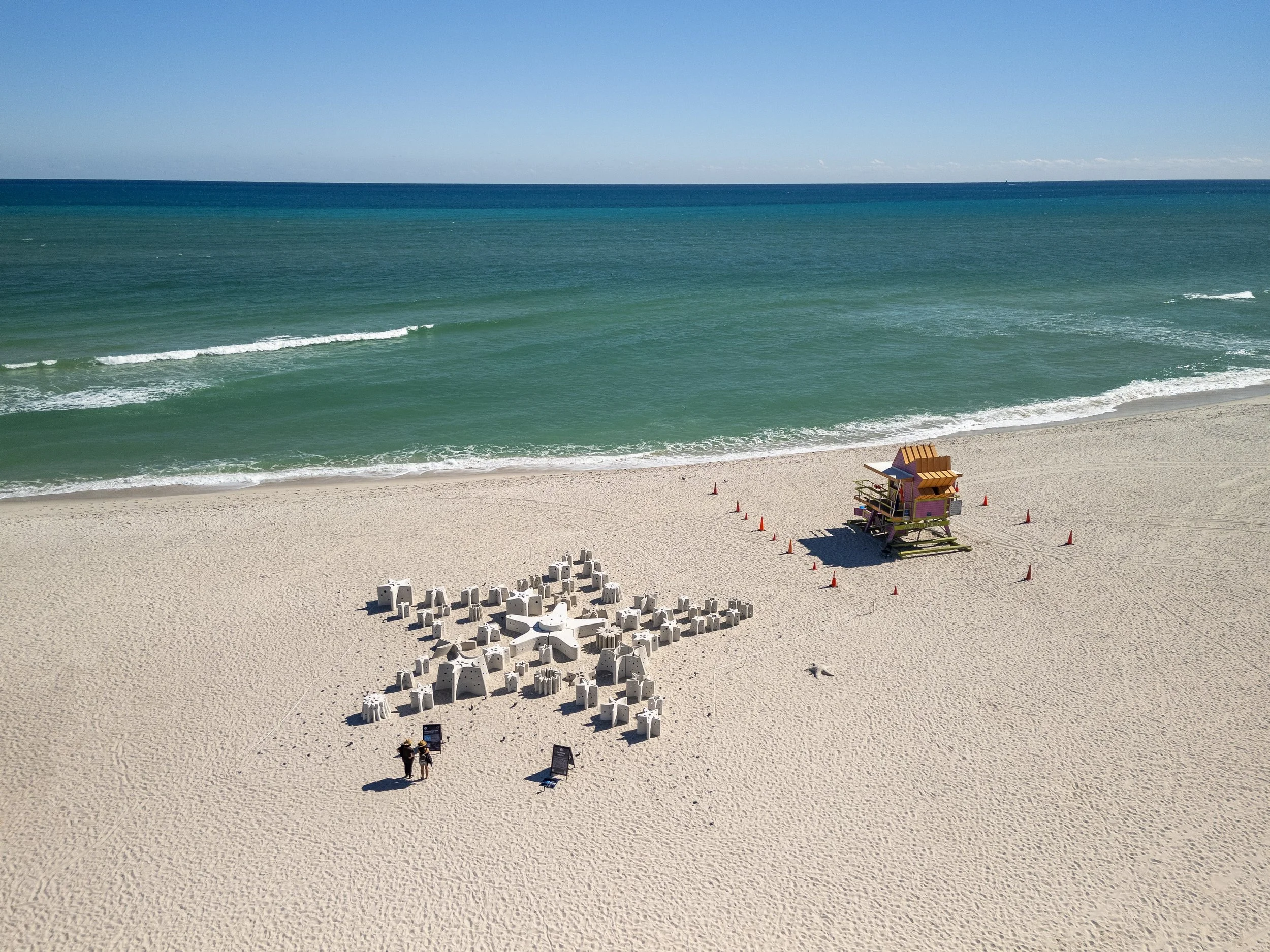
A public project with many ways in.
The Reefline’s audience ranged from ocean scientists and architects to artists, supporters, and people encountering the project for the first time. The work had to remain credible for experts without becoming inaccessible to the public.
Create enough consistency to make the organization recognizable—without flattening the science, art, or ambition behind it.
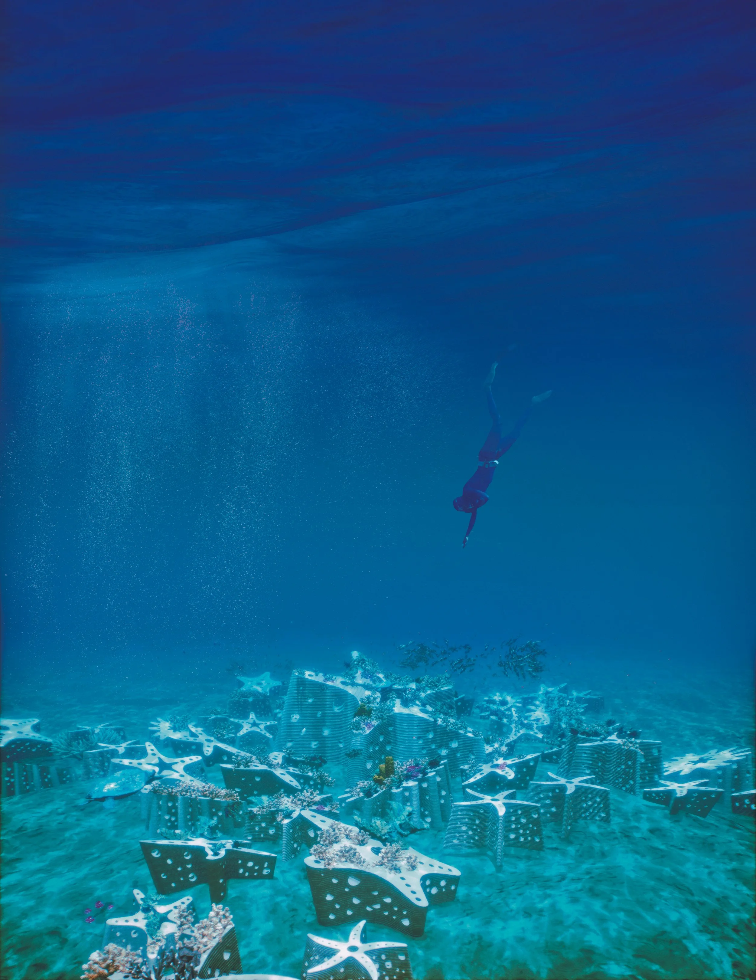
Reaffirming the brand, then making it usable.
System in use
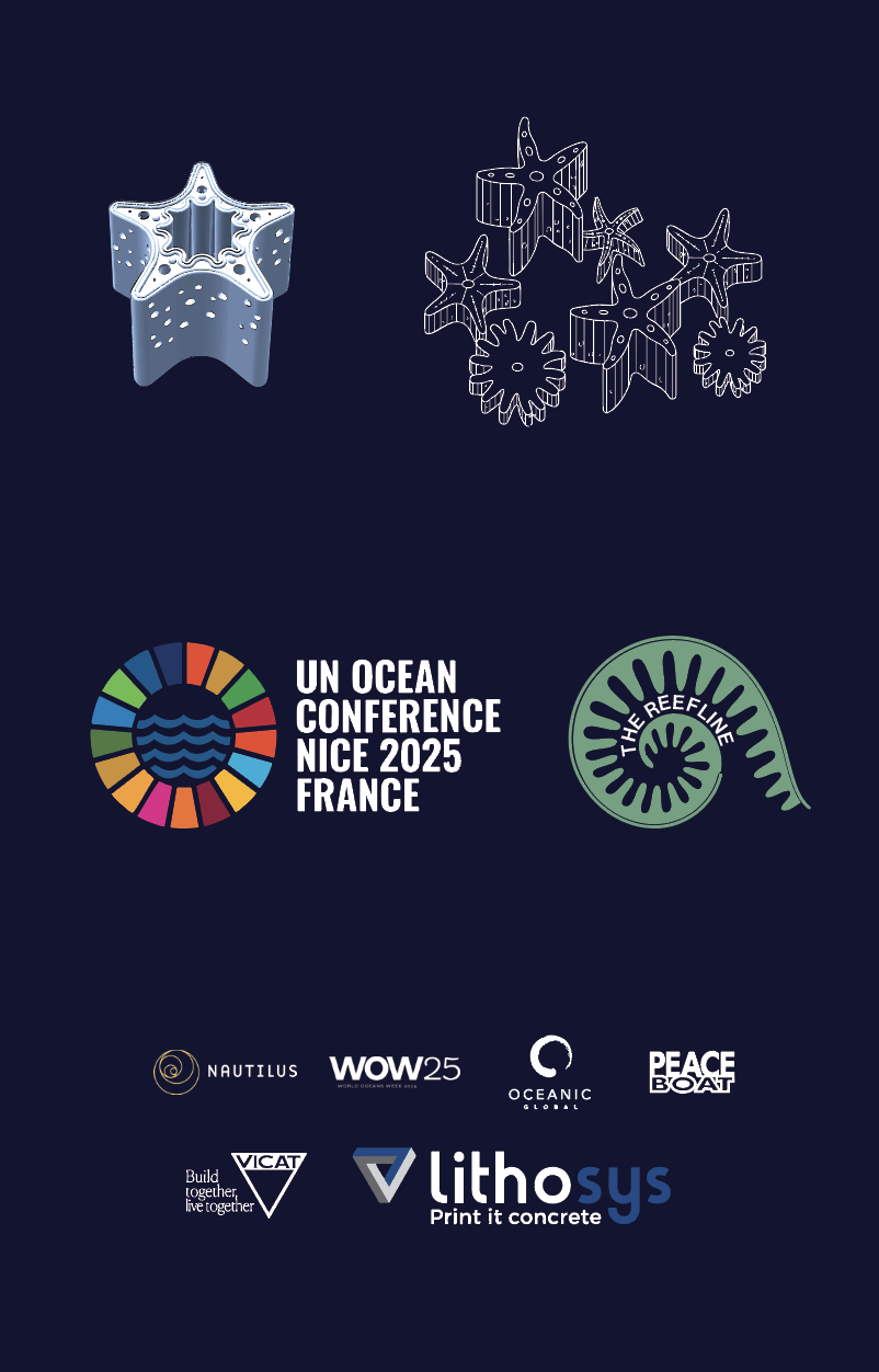
Existing mark
Logo applied—not authored.
The Reefline logo was provided to me. I did not design it; my role was to apply it consistently while helping reaffirm the broader palette, typography, and layout language.
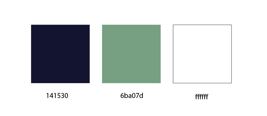
Core palette · #141530 · #6BA07D · #FFFFFF
Typography
ABC CameraIts interrupted letterforms echo the organization’s “marine acupuncture” idea. A supporting sans serif keeps longer information readable. The typeface and logo predated my work; I helped systematize their use.
One system, multiple moments.
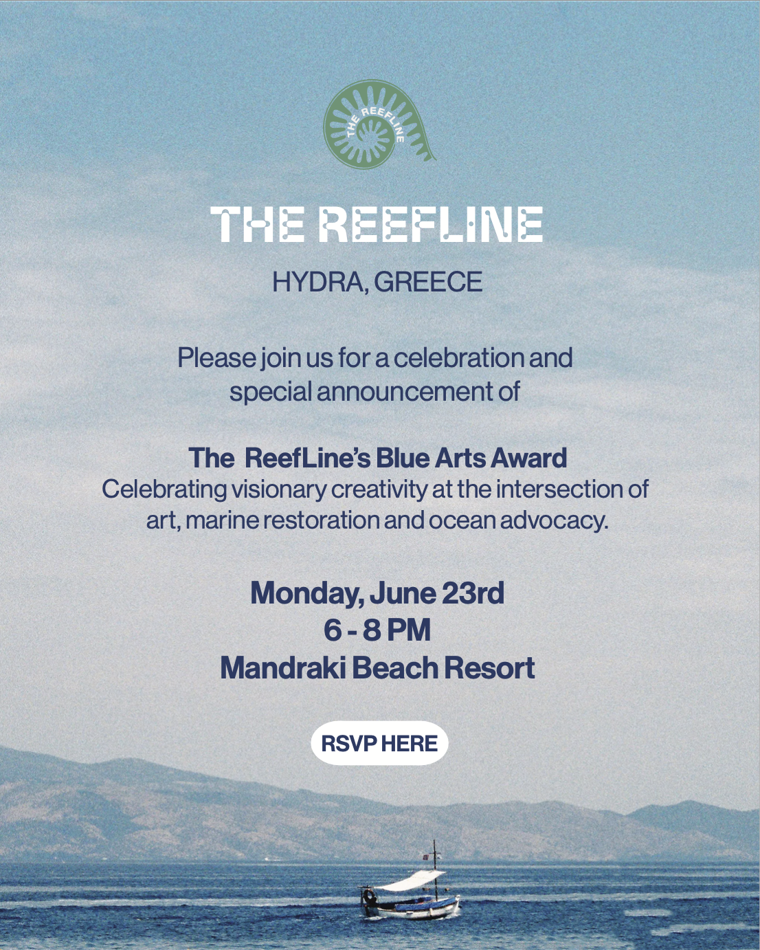
Beyond the conference infographic, I applied the same visual system across invitations, business cards, and event materials—adapting the palette, typography, and image treatment to different formats while keeping The Reefline recognizable.
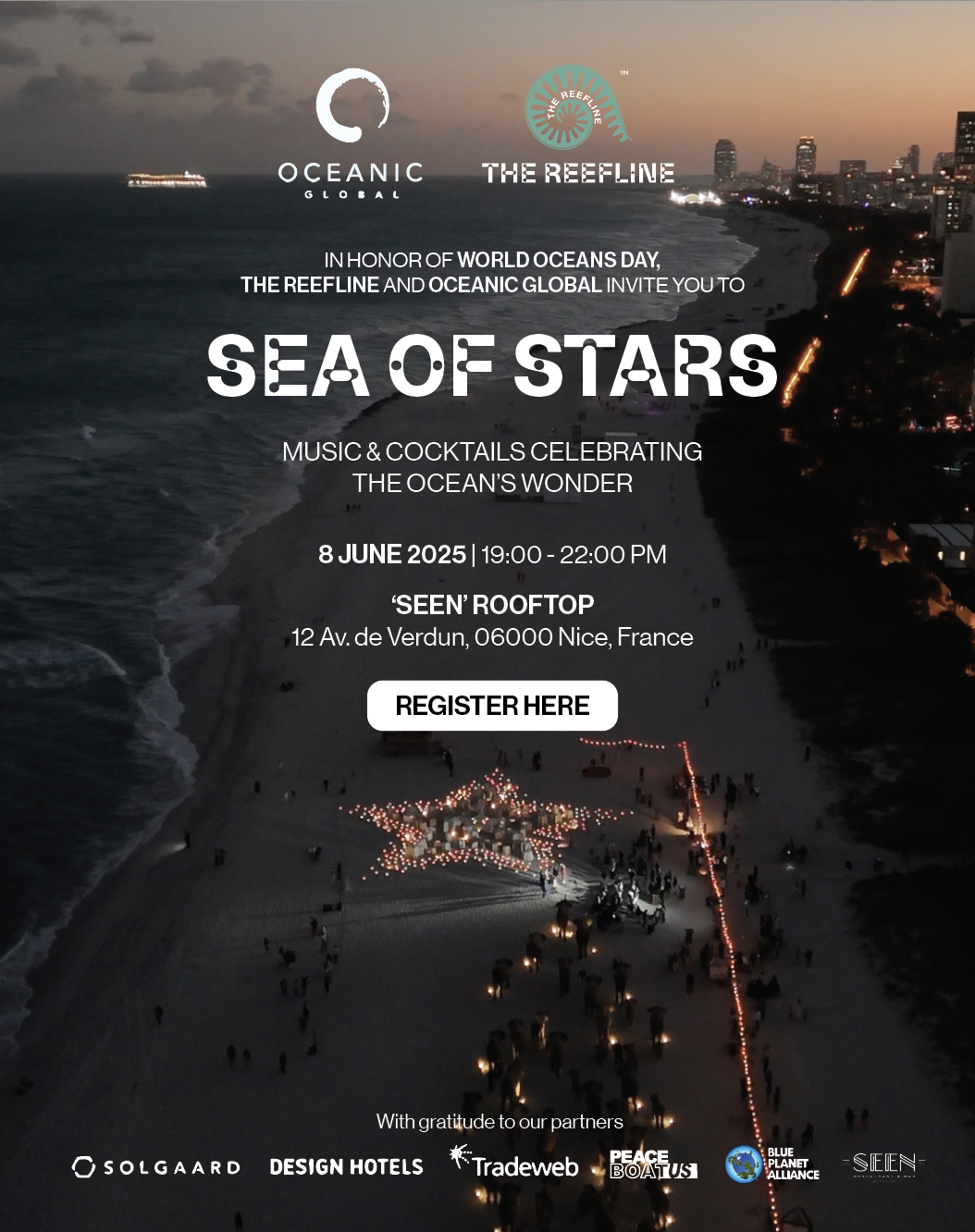


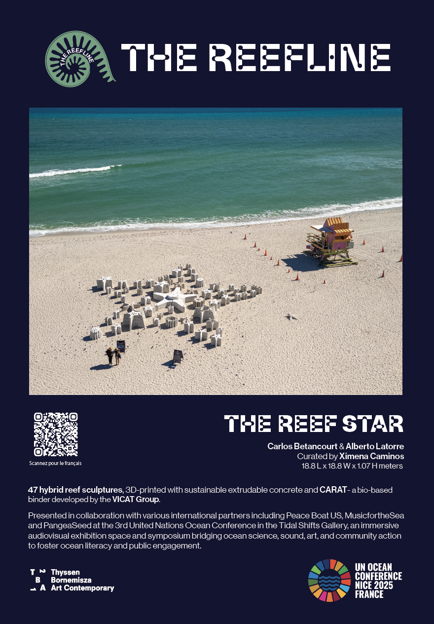
English and French never occupy the same space.
Work from approved English and French copy rather than rewriting specialized content.
Adjust composition for phrases that expand or contract instead of shrinking type to force a match.
Keep the same hierarchy, rhythm, and visual identity across both language versions.
Rebalance, don’t shrink. Each language needed enough space to feel intentionally designed.
Designed independently. Refined collectively.
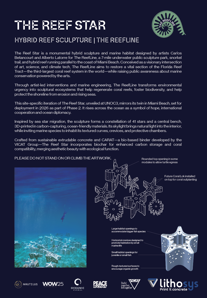
I owned the design work while iterating through feedback from scientists, artists, architects, and creative directors. That required translating a meeting-driven creative brief into layouts that were precise enough for technical stakeholders and inviting enough for a public event.
Consistent logo use, the navy-and-green palette, recognizable display type, clear diagrams, and a restrained informational hierarchy.
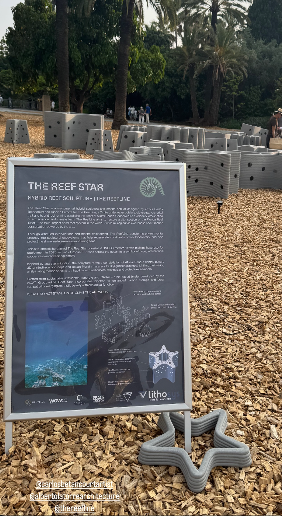
The system reached the booth—not just the artboard.
07 · OUTCOME
A recognizable presence on a global stage.
I created event invitations, business cards, graphics, and the UN Ocean Conference informational piece within the shared visual system. The final conference work was used at the booth and helped present a complex environmental-art project clearly to visitors with different backgrounds and levels of expertise.
Takeaway: A strong visual system does more than make materials match. It gives many kinds of people a shared entry point into the same idea.