South Beach Map

Created with Adobe Illustrator.
Fonts used: Proxima Nova & Artdeco MN
Colors:
For my Signs & Symbols course, I was tasked with designing a map of a place deeply familiar to me. As a Miami Beach native, I wanted to move beyond the common stereotypes of beaches and nightlife and instead highlight the culturally and historically rich dimensions of South Beach.
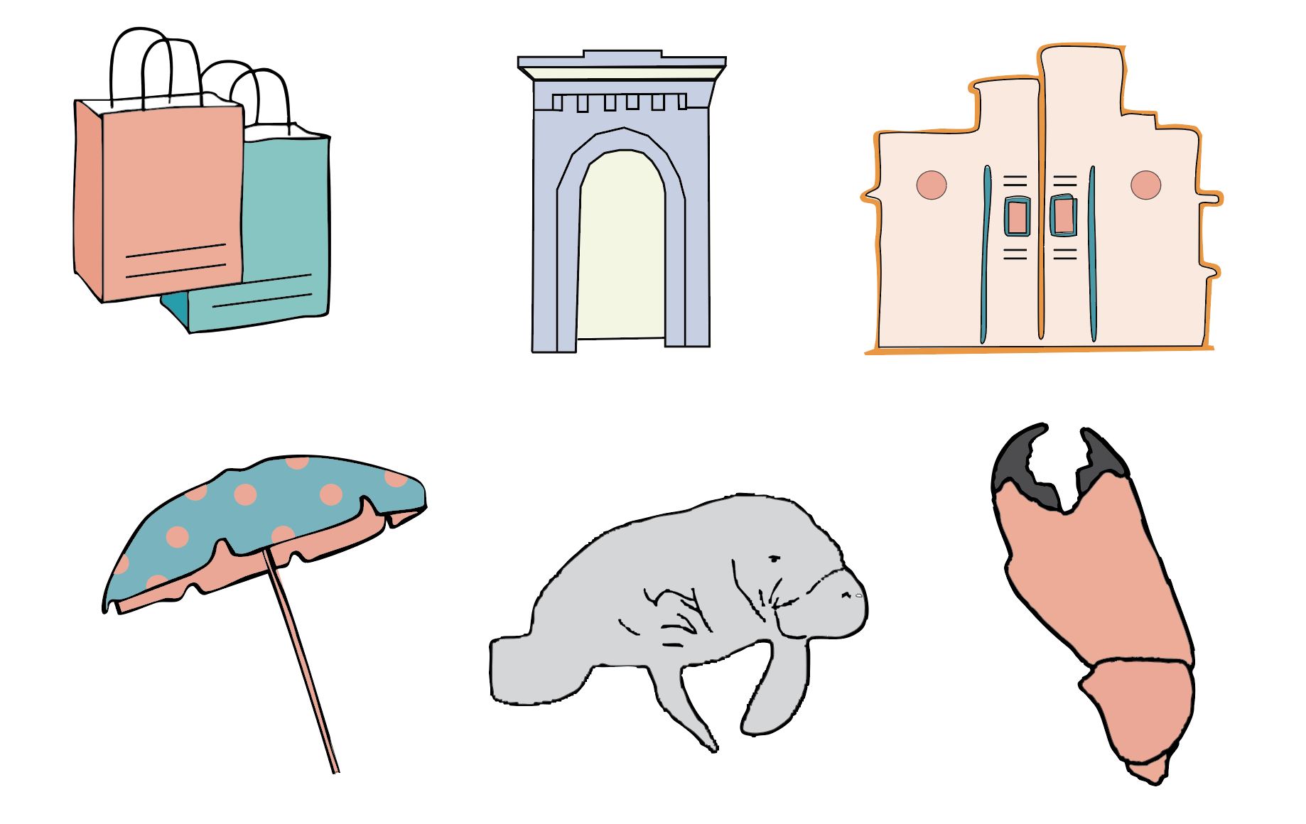
Rather than creating a strictly geographic map, I structured the design as a curated “day in the life” experience, guiding viewers through iconic landmarks such as Lincoln Road, Ocean Drive, South Pointe Park, and Joe’s Stone Crab. The route functions narratively, transforming navigation into storytelling.
The visual system draws heavily from Art Deco architecture, reflecting South Beach’s status as home to the largest concentration of Art Deco buildings in the world. Through geometric ornamentation, pastel tones, and stylized iconography, I translated the district’s architectural identity into a cohesive symbolic language.
This project explores how maps can communicate not just orientation, but culture, using design to reframe place beyond cliché.
Client
Sign & Symbol Class
Year
2025